Creating CSS Grids without the need for media queries
Social Share:
Sunday, May 10, 2026 at 4:10 PM | 6 min read
Last modified on Sunday, May 10, 2026 at 9:37 PM
#css grid, #macOS, #media queries, #teaching
CSS Grid No Media Queries example
Table of Contents
- CSS Grid Recap
- Arranging the Portfolio Gallery with CSS Grid
- The display property and CSS Grid
- 1fr and CSS Grid
- Creating a responsive CSS Grid without the need for a CSS media query
- The CSS Grid minmax() method
- The CSS Grid auto-fit keyword
- Taking into account not only variable image sizes but also variable figcaption lengths
- Combining the Best of Both Worlds
- Related Resources
CSS Grid Recap
A CSS Grid Layout Module (aka CSS Grid) offers a grid-based layout system, with rows and columns, making it easier to design web pages without having to use floats and positioning. And depending on how we code the CSS Grid, we don't even need media queries to make the CSS Grid responsive!
A grid layout consists of a parent element (in our case, the section element), with one or more child elements (in our case, three figure elements).
Arranging the Portfolio Gallery with CSS Grid
Remember the following in our CSS code for the CSS Grid columns on our portfolio.html page?
/* css */
section {
	display: grid;
	grid-template-columns: repeat(3, 1fr);
}
The display property and CSS Grid
An element becomes a grid container when its display property's value is set to grid. This is what we are doing with the section CSS element selector. All direct children of the grid container automatically become grid items. In our case, it is the figure elements.
/* css */
section {
	display: grid;
}
However, unlike Flexbox, which would actually change the layout of the figure elements with the property declaration display: flex, we need to specify the number of columns or rows of our grid and a space-separated list of values. If we don't specify the number of columns or rows, only one column will be displayed, with as many rows as grid items within the grid container(s). In the case of our example, it would be one column and 12 rows. In the case of the demo, six. Or two columns and six rows, or three columns and four rows.
1fr and CSS Grid
fr is a fraction unit in CSS Grid. It can be used when defining grids like any other CSS Length unit such as px, %, or rem.
The great thing about using fr is that if there was overflow previously on the x-axis of the web page, caused by defining a grid-column-gap property declaration on the grid container, because setting each column to 1fr takes that grid-column-gap value into account automatically and subtracts it from the total width available for each column. Here it is 33.33%.
Creating a responsive CSS Grid without the need for a CSS media query
In the original CSS code I created for the professional portfolio class demo site, we used media queries to make the CSS Grid columns responsive. However, I decided to introduce an alternative way of styling the columns that would result in the omission of media queries!
This is the original code I created to make the image columns responsive in the portfolio.html page:
/* css */
section {
	display: grid;
	grid-template-columns: repeat(3, 1fr);
}
Then, to make the columns responsive (that they would be able to fit in smaller viewports requiring different styling), I added a media query using a desktop first approach:
/* css */
/* desktop first code */
section {
    display: grid;
    grid-template-columns: repeat(3, 1fr);
}

/* mobile code made possible by a media query */
@media (max-width: 799px) {
    section {
        grid-template-columns: repeat(1, 1fr);
        // or
        display: block;
        margin: 3rem auto;
    }
}
If I had opted for a mobile first approach, the CSS code would have looked something like the following:
/* css */
section {
	display: block;
	margin: 3rem auto;
}

@media (min-width: 800px) {
	section {
		display: grid;
		grid-template-columns: repeat(3, 1fr);
	}
}
Both approaches get us to the same place. And the code is so short and simple, that either way is fine.
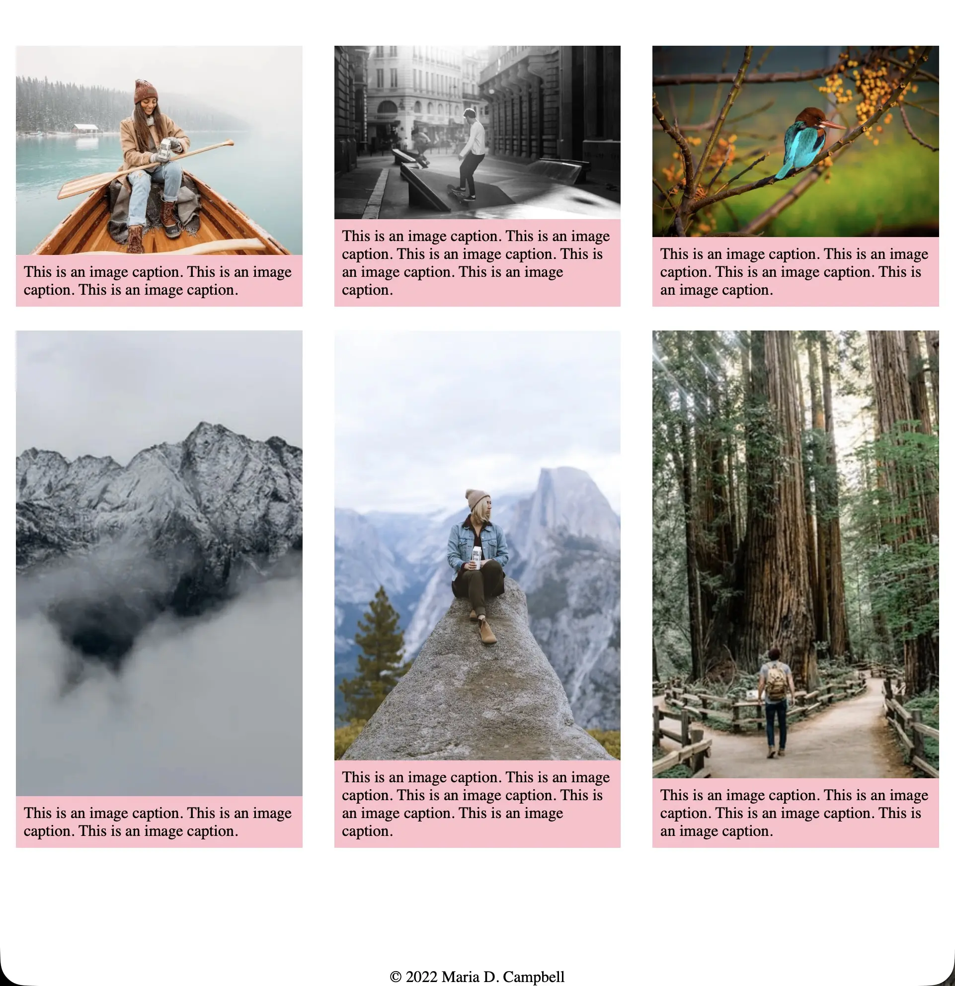
But what about when we want to create a completely responsive CSS Grid that will change the number of columns on its own, auto fitting the content of the page?
Consider the following CSS code:
/* css */
section {
	display: grid;
	grid-template-columns: repeat(auto-fit, minmax(200, 1fr));
}
And the following HTML:
!-- html -->
<section>
	<figure>
		<img src="images/boxed-water-is-better-6aZp4_KfXT8-unsplash.webp" />
		<figcaption>
			<p>This is am image caption.</p>
		</figcaption>
	</figure>
	<figure>
		<img src="images/boxed-water-is-better-6aZp4_KfXT8-unsplash.webp" />
		<figcaption>
			<p>This is am image caption.</p>
		</figcaption>
	</figure>
	<figure>
		<img src="images/boxed-water-is-better-6aZp4_KfXT8-unsplash.webp" />
		<figcaption>
			<p>This is am image caption.</p>
		</figcaption>
	</figure>
	<figure>
		<img src="images/boxed-water-is-better-6aZp4_KfXT8-unsplash.webp" />
		<figcaption>
			<p>This is am image caption.</p>
		</figcaption>
	</figure>
	<figure>
		<img src="images/boxed-water-is-better-6aZp4_KfXT8-unsplash.webp" />
		<figcaption>
			<p>This is am image caption.</p>
		</figcaption>
	</figure>
	<figure>
		<img src="images/boxed-water-is-better-6aZp4_KfXT8-unsplash.webp" />
		<figcaption>
			<p>This is am image caption.</p>
		</figcaption>
	</figure>
</section>
No need for media queries. Let's take a look a this CSS code in action: CSS Grid No Media Query Example.
The CSS Grid minmax() method
In order to set a minimum width for our columns, we use the minmax() method. And this makes sure that the columns don't get too narrow as well. But passing this function to the repeat() function, causes overflow in the row. The columns will not wrap into new rows if the viewport width is too narrow to fit them all with the (new) minimum width requirement, because we are explicitly telling the browser to repeat the columns 12 times, for example, per row.
/* css */
grid-template-columns: repeat(12, minmax(200px, 1fr));
To achieve wrapping, we can use the auto-fit keyword, as shown previously in the new CSS code for the CSS Grid columns defined inside our section element.
The reason why we need to add a media query to the original CSS code is because there was no mechanism to wrap the columns. So we had to explicitly add CSS code that would result in "wrapping" the columns. In our case, transforming three columns into one.
The CSS Grid auto-fit keyword
The CSS Grid auto-fit keyword we pass into the minmax() method tells the browser to handle the column sizing and element wrapping so that the elements (figure elements here) will wrap into rows when the width is not large enough to fit them without overflow. And passing in 1fr fraction unit to minmax() ensures that if the width allows for a fraction of a column to fit and not a full one, the space instead will be distributed over the column or columns that already fit, making sure we aren't left with any empty space at the end of the row.
Specifically, auto-fit FITS the CURRENTLY AVAILABLE columns into the space by expanding them so that they take up any available space. The browser does that after FILLING that extra space with extra columns and then collapsing the empty ones.
Taking into account not only variable image sizes but also variable figcaption lengths
Adding the display flex property declaration to the figure element
In order that both the (potential) variable image size and the (potential) figcaption sizes (dependent on the length of text) are the same height across rows, I set the display: flex property declaration on the figure element selector. So:
/* css */
figure {
	margin: 0 auto;
	width: 90%;
	max-width: 800px;
	/* added these two lines because wanted to make each image and figcaption equal across the rows. Images appear with different heights but total heights are equal. */
	display: flex;
	flex-direction: column;
}
And then to make sure that the img element and the figcaption element within the figure element displayed vertically, I set the flex-direction: column property declaration on the figure element selector as well.
I also added the background: pink property declaration to the figcaption element selector to show that the figure elements indeed were of the same height across rows. You choose how you want it to look!
This is for demonstration purposes only.
For example, if there is a border around the figure element already, then maybe there does not have to be a background color, if that is the way you want to go. It is up to you!
That is the only real difference from the previous version, where the figcaption element text length was exactly the same.
Combining the Best of Both Worlds
BUT perhaps we don't want to have it all one way or all the other. Perhaps we want to make the figure elements all the same height across rows, but we want to keep the columns the way they are when using a media query. That is possible too! The challenge here would be to keep the media query, but add the CSS code that would result in making the figure elements the same height across rows.
Related Resources
- Auto-Sizing Columns in CSS Grid: auto-fill vs auto-fit Avatar: by Sara Soueidan, CSS Tricks
- Box alignment in grid layout: MDN
- CSS Grid No Media Query Example: interglobalmedia (Maria D. Campbell), Github GH Pages